In t
In this article
he early 2010s, a very big idea circulated in Silicon Valley: what if the whole phone were built around people instead of apps? Instead of tapping icons, you’d open your phone and see your friends’ photos and messages. Facebook Home, a software layer for Android phones, tried this. It drew huge attention at launch and faded quickly. The reasons are instructive for anyone building mobile software today.
The Facebook Home concept
Android allows something unusual among mobile systems: you can replace the home screen with a custom launcher. Most launchers change icon layouts or themes. A few tried to alter the core experience. The social-first approach replaced the app grid with a continuous feed of friends’ updates and an always-visible chat bubble that floated over whatever you were doing.
On paper, it matched how people used phones. Social apps took up a big share of time, so why not make them the main screen?
Why Facebook Home struggled
It solved a problem few people felt
Most users were happy with their home screens. Opening an app is fast and familiar. Replacing a known layout with an unfamiliar one demanded effort, and the payoff was unclear. A product that asks people to change habits needs a benefit they can feel immediately.
Privacy discomfort
Handing a social company control of your phone’s front door felt invasive to many. Concerns about data collection, notifications, and battery use were widespread. Trust is hard to earn when software sits so close to everything you do.
Hardware limits
The software was available only on a small number of devices at first, limiting reach. A launcher sits at the mercy of the phone’s performance, and slower devices felt sluggish with a constantly updating feed.
A feed isn’t a launcher
Phones are tools for many tasks: maps, calendars, banking, cameras, music. A home screen needs quick, reliable access to all of them. A social-only feed made those tasks slower, not faster.
The platform owner’s interests
The operating system maker had its own priorities, and the relationship between a platform and an app company that wants to take over the interface is awkward. Later changes in the platform’s policies also limited what launchers could do.
What Facebook Home got right
It’s easy to mock a failed product, but some ideas were prescient.
- Chat heads. Floating conversation bubbles that stay visible while you use other apps became a common pattern in messaging software.
- Ambient notifications. The Facebook Home concept of glanceable information on a lock screen is now standard.
- People-centered design. Many interfaces now surface contacts and conversations prominently.
Good ideas often survive even when the product that introduced them doesn’t.
Lessons for app makers from Facebook Home
- Respect habits. Changing core behavior requires a large, obvious benefit.
- Earn trust before asking for access. The more of a device you control, the more transparency you owe users.
- Don’t fight your platform. Building atop an operating system owned by others carries risk.
- Measure real use. Launch buzz and downloads mean little if people switch back after a week.
- Make it optional. Let users try features without committing their whole device.
The launcher world today
Custom launchers still thrive among enthusiasts, offering themes, gestures, and productivity features. The most popular ones succeed by being fast, customizable, and unobtrusive. They enhance the phone rather than trying to turn it into a different product. Meanwhile, operating system makers incorporate features like widgets, suggested apps, and AI assistants that offer similar convenience under the system’s own control.
A broader point about ambition
Failed products often reveal where a market’s boundaries lie. The attempt to make social the center of the phone showed that people see their phones as personal tools, not just channels to one service. The more a product tries to own the whole experience, the more it must justify that control.
What made Facebook Home different from other launchers
Most launchers change icons, widgets and animations. Facebook Home went further and replaced the lock screen with a stream of friends’ photos and updates, with chat heads floating above whatever else you were doing. It sat on top of Android as an app, not as a new operating system, and its story is summarised in the article on Facebook Home. The idea was ambitious: put people first and apps second.
Why people turned away from Facebook Home
Phones are personal, and a launcher decides what you see hundreds of times a day. Many users did not want a single service to take over that space, especially one that also wanted to track their activity. Battery use, a limited choice of devices and the loss of familiar layouts added friction. Reviews at the time were mixed, and the product faded rather than exploded.
The pattern is familiar in messaging too. Our history of messaging apps, a short history of messaging apps and market share, shows how hard it is to change habits once people settle into a place.
What Facebook Home still teaches app makers
Respect the user’s control. People are happy to add a service to their day, but they resist one that takes over the whole screen. Test the idea on a small group before building a custom device around it. And remember that one clever feature, such as chat heads, can outlive the product that introduced it. That is perhaps the best legacy of Facebook Home.
Takeaway
The story of a social-first home screen is a classic case of a big company misjudging what users actually wanted. It was ambitious, well-funded, and technically interesting, yet it stumbled over habit, trust, and practical usefulness. When you evaluate the next big interface idea, ask whether it makes everyday tasks faster, who is in control of your data, and what happens if you simply want to go back to what you had.
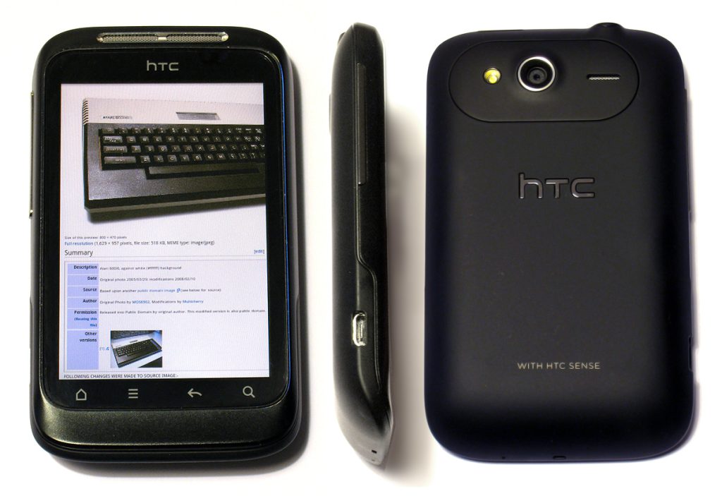
Featured image: HTC Wildfire S Viewpoints.jpg by Main image by Multicherry
(Image on screen- part of a Wikimedia Commons page- i, CC0, via Wikimedia Commons.