Most people never think about the font on their music app. They notice the album art, the play button, the song title. But the letters that spell that title were chosen, and increasingly they were built from scratch. Custom fonts are one of the quieter investments a digital brand can make, and it pays off in ways that go beyond looking good.
Custom fonts give a brand a voice
Typefaces carry tone before a word is read. A tall, narrow face can feel urgent and editorial. Round, open letters feel friendly. A geometric sans suggests technology. When a brand uses the same off-the-shelf font as thousands of others, it shares a voice with them. A set of custom fonts lets the company decide how it sounds in headlines, menus and ads.

Distinctiveness is the core argument for custom fonts. A brand that reaches people on phones, billboards, packaging and in video wants every touchpoint to feel like one thing. A signature typeface becomes a recognizable asset, like a color or a logo, and helps even small pieces of text look unmistakably theirs.
Think about a streaming service. Its logo may appear once per screen, but its letters appear everywhere: menus, titles, buttons, ads, subtitles. If those letters are the same ones a hundred other apps use, the screen could belong to anyone. With custom fonts, a viewer glancing at a billboard or a thumbnail recognizes the brand before reading a word.
The practical reasons
Licensing is the unglamorous reason many companies commission fonts. Commercial typefaces are often licensed per user, per app or per number of page views. At the scale of a service with hundreds of millions of users, those fees can add up, and the terms can change or restrict use in ways that complicate product plans. Owning the font, or holding a broad license from a type foundry, removes that uncertainty.
Performance is another. A custom font can be designed with only the characters a product needs, and built for compact file sizes. Smaller font files load faster, which matters on slow connections and low-end phones. Designers can also tune the font to look sharp at small sizes on screens, where thin strokes can blur.
Language coverage matters
A global app must display many writing systems. Latin, Cyrillic, Arabic, Devanagari, Thai, Japanese and others each have their own design needs. A custom family can be extended with matching scripts so that a headline looks consistent whether a user reads English or Hindi. Commissioning custom fonts across scripts takes time and specialist designers, but it prevents the patchwork look you get when a product falls back on random system fonts for unsupported languages.
What goes into making one
- Brief and research: what the brand stands for, where the text will appear, and what existing typefaces get wrong for it.
- Drawing: designers craft the letter shapes, usually starting with a few key characters and building outward.
- Weights and styles: a usable family needs regular, bold, italics and perhaps variable axes that adjust weight smoothly.
- Spacing and hinting: fine-tuning how letters sit together and render on screens.
- Testing: checking it in actual product interfaces, in dark mode, at small sizes and in every supported language.
It is rarely quick. Even a modest family can take months, and large multi-script systems can take years.
Not every company needs this. A small team can build a strong identity with a well-chosen licensed family and consistent use, and design tools make it easy to try options cheaply. It is worth reading about how designers choose their tools and why experimental apps are abandoned, which both remind us that polish never replaces a clear product. For the vocabulary, see the general article on a typeface.
There is also a craft side worth appreciating. Type designers spend weeks adjusting how a single letter meets the next, because small changes in spacing alter how readable a paragraph feels. Custom fonts built for screens can include tweaks for small sizes, where the counters of letters like e and a must stay open so they do not fill in. These details are why a commissioned family often feels calmer and clearer than a generic one, even when users cannot say why.
Cost is real, of course. A full family in several scripts can take many months and a meaningful budget, and it needs maintenance as devices and operating systems change.
The skeptic’s view
Is it worth it? For a small startup, probably not. Excellent fonts exist in open-source libraries and affordable foundries, and a distinctive layout, color and imagery can do much of the same work. A custom font is a luxury that makes sense when scale, licensing costs and brand strategy all point the same way.
There is also the risk of vanity. A typeface that looks fresh in a launch announcement can age poorly, or hurt readability if its shapes are too quirky. The best ones are slightly unusual but stay invisible in use, because people should read the words, not admire the letters.
What to look for next time
You can spot the effect if you pay attention. Check the capital R or the numeral 1 in an app you use daily and compare it with the same character elsewhere. Brands that care often hide small details there. Once you start noticing, you realize how much of a product’s personality lives in something most users never consciously see, and why companies are willing to pay to get it right.
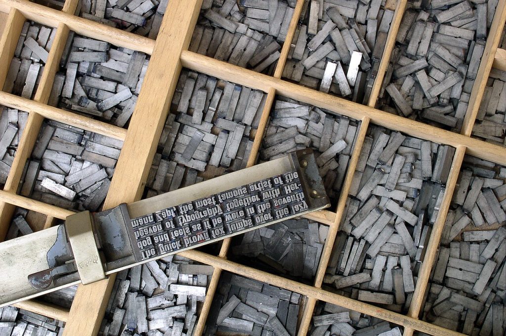
Image: Willi Heidelbach / Wikimedia Commons, CC BY 2.5.