Look at the top edge of your phone. Somewhere up there is a camera, maybe a few sensors and a row of tiny icons for the time, battery and signal. That strip is easy to ignore, yet phone status bar design has quietly become one of the most argued-over details in hardware. Every phone maker has had to answer the same awkward question: where do you put the front camera when you want the screen to fill the whole face?
From bezels to notches
Early smartphones had thick borders above and below the screen. That space held the earpiece, the camera and sensors, and nobody questioned it. As people asked for bigger displays in the same body, makers pushed the screen toward the edges.
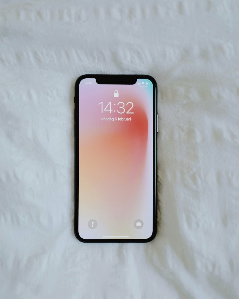
The camera was the obstacle. It needs light and a clear view, so it cannot sit behind a normal display easily. Designers responded with the notch, a cut into the top of the screen. It was blunt but effective, and it made phone status bar design a visible talking point because the icons had to fit around the cut.
The notch had a side effect. It created two small zones of usable space on either side, and software had to decide what to show there. Many phones squeezed signal and battery to the left and right, leaving less room for notification icons.
Teardrops, punch holes and pills in phone status bar design
Notches shrank. Some became small teardrops. Others gave way to punch-hole cameras, a tiny circle cut into the display. These took less space and let more of the screen show content, especially in video.
The next step was the pill, a slim oval housing the camera and sensors. It is still a cutout, but it is a deliberate shape, which gives designers something to work with. Instead of hiding the hardware, they started to treat it as part of the interface.
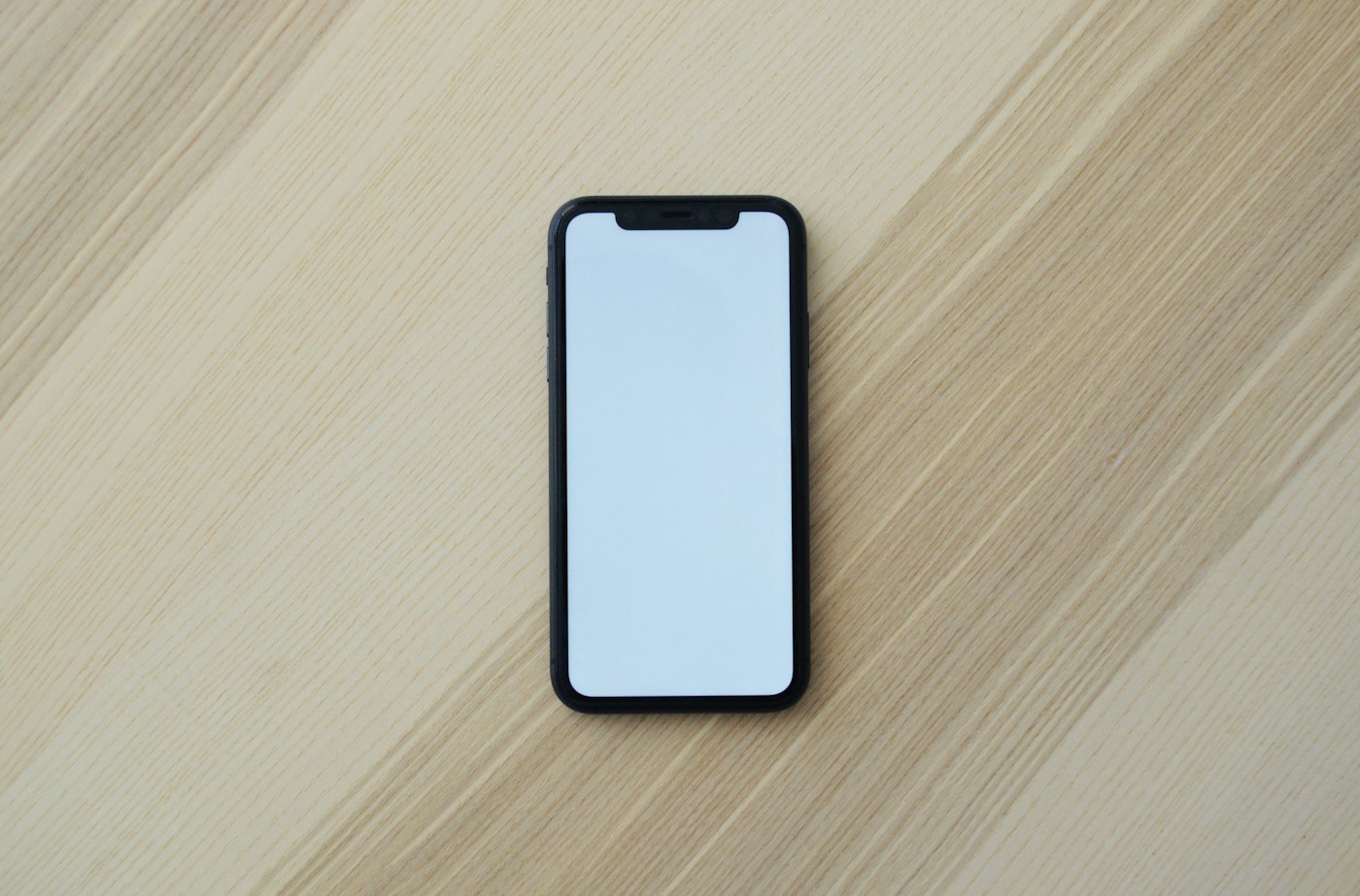
That is where phone status bar design became interesting. A cutout in a fixed place is a permanent feature of the screen, so software can animate around it, expand it and attach information to it.
When the cutout becomes the interface
Some phones turn the area around the pill into a small live space. It can show a timer, a music controller, a call in progress or navigation directions, and it can grow or shrink with an animation. It is an elegant answer to the problem of phone status bar design, because the hardware limitation turns into a feature.
Not everyone agrees. Critics say these designs invite clutter, that they teach users to look at a part of the screen they used to ignore, and that they reward complexity. Others say the opposite: a glanceable spot for ongoing activity is more useful than a row of tiny icons you cannot read. Both views are reasonable, which is why phone status bar design keeps changing.
If you are shopping for a new device, the screen is only part of the picture. Our guide on choosing between pro and max chip tiers shows how to separate marketing from meaningful differences, and the same skepticism applies to display cutouts.
Under-display cameras: the cleaner promise
The obvious dream is no cutout at all. A few manufacturers have placed the front camera underneath the display, letting the pixels above it go transparent or thin when the camera is in use. The screen then looks uninterrupted.
There are tradeoffs. Light has to pass through the display layers, which can reduce image quality, causing softer or noisier selfies. The area above the camera may also look slightly different from the rest of the screen. Makers keep improving it, but the compromise remains real, and many choose a visible cutout because the camera works better.
What good phone status bar design looks like
Apart from the hardware, the software decisions matter. A good design keeps the essentials readable: time, battery, signal and a few notifications. It adapts to dark and light content so icons never vanish against the background. It respects people who hold the phone in different ways and does not make unexpected taps easy.
It also treats accessibility as a requirement. Larger text, high contrast and clear spacing are not extras. Phone status bar design affects everyone, but it affects people with low vision most. Watches and wearables face the same pressure at a smaller scale, as this article on waiting or buying a new smartwatch explains.
What to check before you buy
Do not judge phone status bar design by a render. Look at it in person if you can. Check whether the cutout bothers you in the apps you use most, like video, maps and games. Try the status bar in dark and light mode, and see how many notification icons fit. If you take many selfies, compare camera quality, not just appearance. Remember that the cutout is on screen every moment you use the device, so small annoyances add up.
The smartphone has been through many shapes, and the top edge is still unsettled. That is a good sign. It means designers are still trying to make the screen bigger without hiding what matters.
Where it goes next
Expect gradual change instead of a single leap. Cameras will get smaller, under-display tech will improve and software will keep finding uses for the space around the lens. Phone status bar design will probably settle on a balance: a tiny visible hole for quality, with software that makes it feel intentional. Until then, the strip at the top of your screen remains a small window into how much trouble engineers go to for a few extra millimeters of display.